
Websites

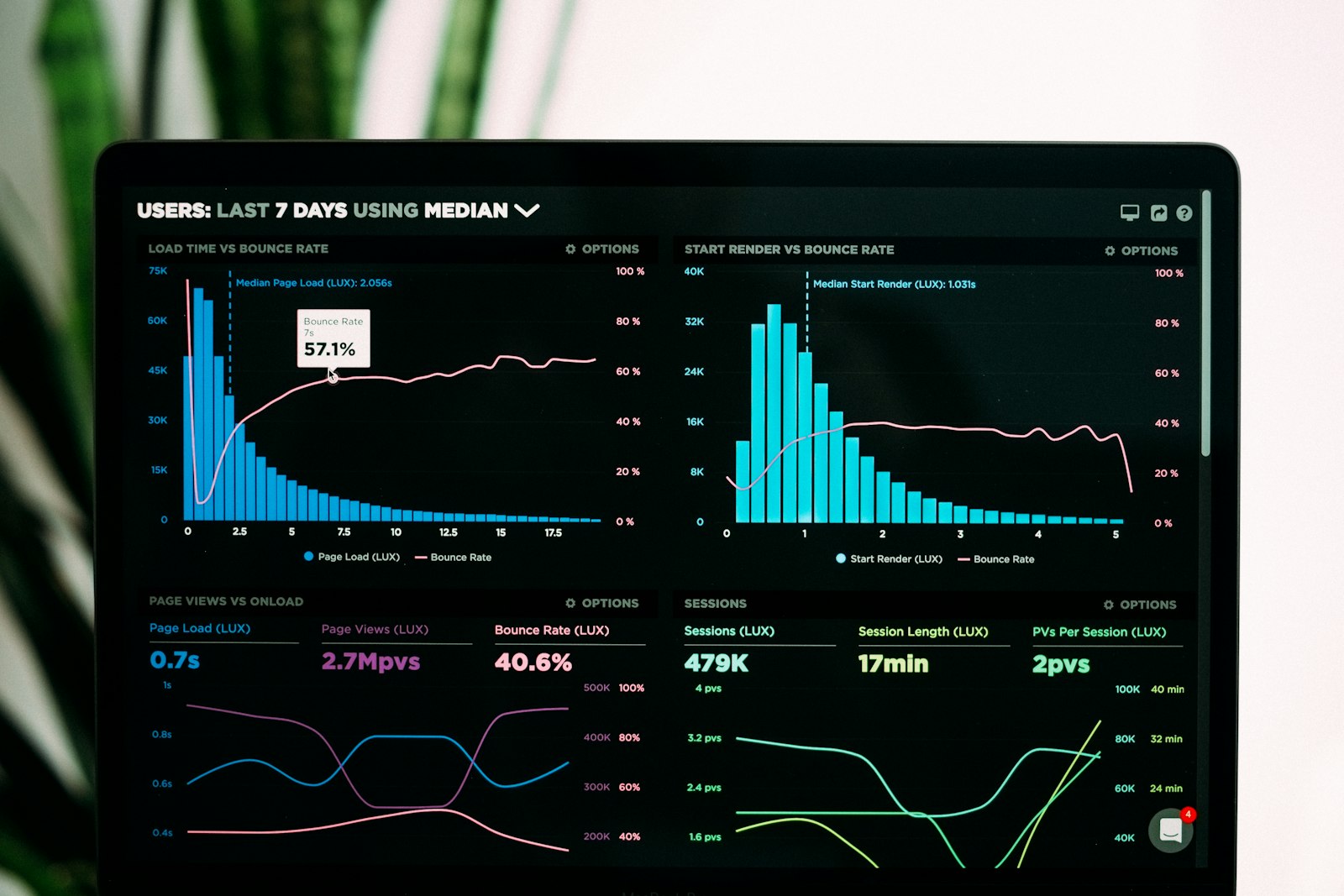
Your ad brings the click, but the landing page makes the sale. 70 % of ad spend drains away if the page does not convert. Let us go through what a good landing page contains.
In brief
- One clear main message at the top.
- One clear main action (CTA).
- The top of the page loads in under 2 seconds.
- Social proof (reviews, logos) clearly visible.
The anatomy of a good landing page
- Main headline — says in 5 seconds what you sell and to whom
- Subheading: sharpens the promise
- CTA button: a clear action, visible without scrolling
- Hero image or video — reinforces the message
- Benefits: 3–5 key benefits as a list
- Social proof: customers, reviews, logos
- FAQ — answers the most common doubts
- The CTA repeats: at several points down the page
The most common mistakes
- Too many CTAs: the customer does not know what to do and does nothing
- The headline talks about you (“We are the best…”) rather than the customer
- Too long a form (over five fields halves conversions)
- No social proof — the customer does not trust you
- A poor mobile experience — 70 % of visitors are on a phone
Realistic conversion rates
- Online store: 1–4 %
- Service page (enquiry): 2–8 %
- A downloadable B2B guide — 15–30 %
- Webinar registration: 20–40 %
Frequently asked questions

One CTA or several?
One main one. Others can be secondary (“Watch the video”, for instance).
How long should a landing page be?
It depends on the product. An impulse purchase, short (400–800 words); a considered B2B purchase, long (2,000–4,000 words).
Where should the CTA button be?
In the first view (above the fold) and repeated at several points down the page.
Worth a look too
External sources:
Want practical support?
Book a free 30-minute assessment. We go through your situation and work out the best next step.
Related articles
Websites
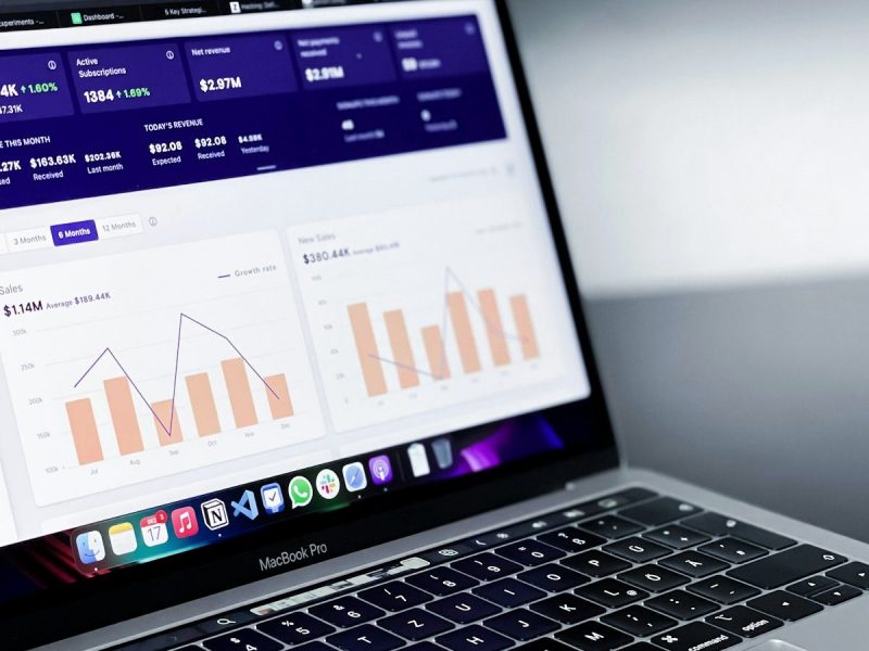
Visitors but no enquiries: a guide to conversion optimisation
Conversion optimisation means improving a site so that a larger share of visitors take the desired action: get in touch, buy or book. It…
8 min

Websites
Website redesign: when it is worth it and what it really costs
A website redesign is worth doing when the current site does not produce enquiries, looks dated on a phone, or is so awkward to…
8 min
Websites
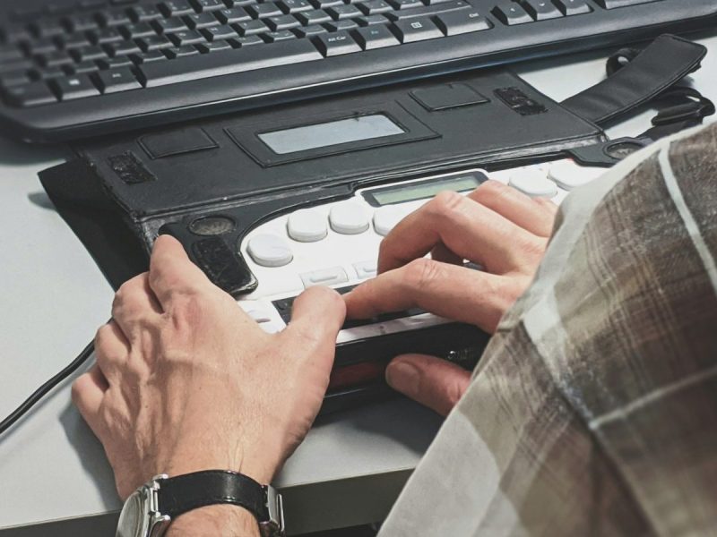
Website accessibility: does the requirement apply to you and what does it demand
Website accessibility means a site can be used even when sight, hearing, motor skills or concentration are limited. For the public sector it is…
8 min
Get in touch
Shall we take the first step together?
Tell us briefly where you stand. We reply the same working day, usually within a couple of hours.
- A free 30-minute call, no strings attached
- You get a concrete view of where you stand
- We say plainly if we are not the right fit
- Phone+358 50 469 0039
- Emailmisa@purodigital.fi