
Websites

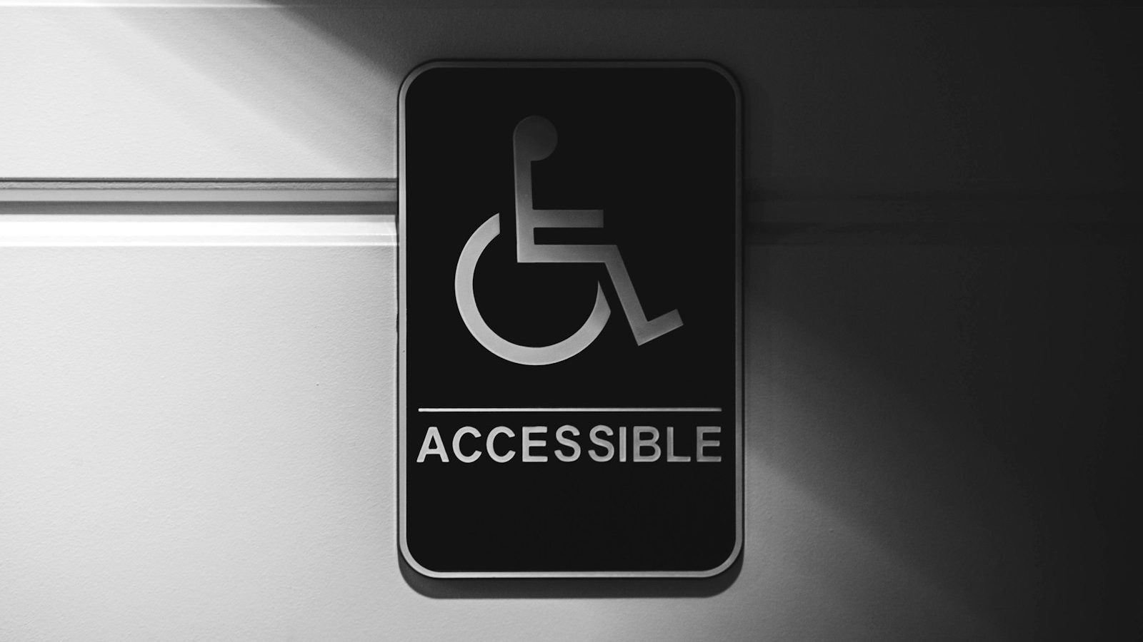
Website accessibility means a site can be used even when sight, hearing, motor skills or concentration are limited. For the public sector it is a legal obligation, and with the European Accessibility Act the requirements extend ever more widely to businesses too.
In this guide I go through what accessibility demands in practice, which shortcomings are most common on company websites and how the fixes are made without rebuilding the whole site.

Who accessibility applies to and why it pays off
Accessibility requirements apply to public administration, publicly funded organisations and, increasingly, private service providers within the scope of the accessibility directive, online stores and banking and transport services for example. If you work as a subcontractor to the public sector, the requirement often arrives through the contract terms.
Even outside the obligation, accessibility pays off for three reasons. It widens the customer base: a significant share of the population has some functional limitation, and the share grows as the population ages. It improves usability for everyone: clear contrast and a logical structure also help the hurried buyer poking at a phone in bright sunlight. And it supports search visibility, because the same things (structure, heading hierarchy, image descriptions) also help search engines and AI search read the site.
WCAG in brief: four principles
The international standard for accessibility is WCAG, and the required level is usually AA. Its four principles are easy to remember:
- Perceivable. The content can be sensed: images have text alternatives, videos have captions, contrast is sufficient.
- Operable. The site can be used with a keyboard; nothing requires a mouse or precise timing.
- Understandable. The language is clear, functions are consistent, error messages help you fix things.
- Robust. The code follows the standards, so assistive technology can interpret it.
The eight most common shortcomings and how to fix them
1. Images missing alt text
Every content image needs a text alternative saying what is in the image. A decorative image is given an empty alt attribute so the screen reader skips it. Good alt text describes the content; it does not repeat the file name.
2. Contrast that is too weak
Light grey text on white is the most common visual error. Body text needs a contrast ratio of at least 4.5:1 and large headings 3:1. Checking takes seconds with free contrast calculators.
3. Keyboard use does not work
Test it yourself: press Tab and move around the site without a mouse. Can you reach the menus, the forms and the buttons? Is the focus clearly visible? If the focus outline has been hidden with CSS, that is a straightforward accessibility error and one of the most common.

4. Broken heading hierarchy
A page should have one H1 and, below it, H2 and H3 levels that progress logically. Heading levels are chosen by structure, not by appearance. A screen reader user browses the page by its headings the way a sighted user skims it.
5. Forms without proper labels
Every field needs a label element, not just placeholder text that disappears as you type. Error messages have to say what went wrong and how to fix it, not just show a red border.
6. Link text that says nothing
“Read more” and “click here” are useless when links are browsed as a list without the surrounding text. Put the name of the destination in the link. The same fix directly improves search visibility too.
7. Videos without captions
Captions serve not only deaf and hard-of-hearing users but everyone watching a video with the sound off. Automatic captions are a starting point, but they need proofreading, because automatic interpretation often goes wrong.
8. No accessibility statement
Organisations under the obligation are required to publish an accessibility statement describing the site’s state, the known shortcomings and a feedback channel. A missing statement is itself a shortcoming, and an easy one to fix.
Does your site meet the requirements?
We run an accessibility check and tell you which shortcomings are critical and which can wait.
How to check your site’s state in an hour
Three tests get you surprisingly far:
- An automated tool. WAVE or Lighthouse’s accessibility section finds the machine-checkable shortcomings, missing alt text and contrast for example. It covers an estimated third of the requirements.
- The keyboard test. Browse the whole site using only Tab and try to submit the contact form.
- The zoom test. Zoom the browser to 200 per cent. Does the content stay readable and functional, or do elements overlap?
An automated tool is not enough on its own, because a large share of the requirements need human judgement: is the alt text genuinely descriptive, does the content progress logically, are the error messages understandable.
Build accessibility in, do not bolt it on
Fixing afterwards is always more expensive than doing it right from the start. If you are rebuilding a site, put accessibility into the requirements immediately: it is a design and implementation question, not a separate add-on. Be wary of standalone “accessibility widgets” that promise to fix a site with one script: they do not fix structural problems and they do not meet the requirements. We build accessibility into every one of our website projects.
Accessibility in ecommerce and in forms
In an online store accessibility errors cost money directly, because they land on the buying path. Typical problems: choosing product variants works only with a mouse, a cart update does not announce the change to a screen reader, and errors at the payment stage are shown only by colour.
In forms, three things decide. Every field has a visible label, the error message says in words what went wrong and in which field, and the field order is logical when moving by keyboard. These fixes improve conversion for all users, not only for users of assistive technology.
Colour and visual design
Colour must not be the only way information is conveyed. A red field is not enough to indicate an error, because a colour-blind user cannot tell: text or a symbol is needed as well. The same goes for charts and status markers.
The contrast requirement also covers interface elements: button borders, icons and form field outlines. A light grey border on a white background is pretty but often falls short of the requirements.
Font size and line spacing affect readability more than the choice of typeface. Body text at a minimum of 16 pixels and line spacing of about 1.5 is a good starting point.
How to prioritise accessibility
Everything does not have to be fixed at once. The sensible order is this: first the things that prevent use entirely (functions that do not work by keyboard, forms that cannot be filled in), then the things that make use harder (contrast, missing alt text), and fine-tuning last.
If you fix only three things, fix these: get keyboard use working, get contrast to a sufficient level and get form labels in order. They cover a large share of the practical problems and are reasonably quick to implement.
Summary: a three-level approach
Accessibility is worth splitting into three levels so the work does not feel overwhelming. The first level is removing barriers: keyboard use, working forms, and making sure no function is impossible with assistive technology. These are fixed first, because they prevent use entirely.
The second level is making use easier: contrast, alt text, heading structure and descriptive link text. These are quick to fix and improve the experience for all users.
The third level is maintenance: new content is made correctly from the start, and accessibility is part of the requirements for every site project. Once that is routine, no new remediation debt accumulates.
Frequently asked questions
What does website accessibility mean?
That the site can be used with limitations too: with a screen reader, with the keyboard alone, magnified or without sound. In practice it means text alternatives for images, sufficient contrast, a clear structure and working forms.
Does the accessibility requirement apply to my company?
It applies directly to public administration and publicly funded organisations. With the accessibility directive the requirements extend to many private services too, online stores among them. For a public-sector subcontractor the requirement often arrives through the contract terms.
What is WCAG level AA?
WCAG is the international accessibility standard and AA is its most commonly required level. It includes, for example, a minimum text contrast of 4.5:1, full keyboard operation and text alternatives for images.
Does accessibility improve search visibility?
Indirectly, yes. A clear heading hierarchy, descriptive link text, alt text and a logical structure also help search engines and AI search understand the site. A direct ranking advantage from accessibility is not something to expect, though.
Is an accessibility tool or widget enough for a site?
No. Automated tools find some of the shortcomings, and bolt-on widgets do not fix structural problems at all. Meeting the requirements calls for fixes in the site’s own code and content.
Related articles

Websites
Visitors but no enquiries: a guide to conversion optimisation
Conversion optimisation means improving a site so that a larger share of visitors take the desired action: get in touch, buy or book. It…
8 min

Websites
Website redesign: when it is worth it and what it really costs
A website redesign is worth doing when the current site does not produce enquiries, looks dated on a phone, or is so awkward to…
8 min
Websites
Starting an online store: what to decide before you open
Starting an online store is technically easier than ever: a shop can be up in days for a few hundred euros. The hard part…
8 min
Get in touch
Shall we take the first step together?
Tell us briefly where you stand. We reply the same working day, usually within a couple of hours.
- A free 30-minute call, no strings attached
- You get a concrete view of where you stand
- We say plainly if we are not the right fit
- Phone+358 50 469 0039
- Emailmisa@purodigital.fi